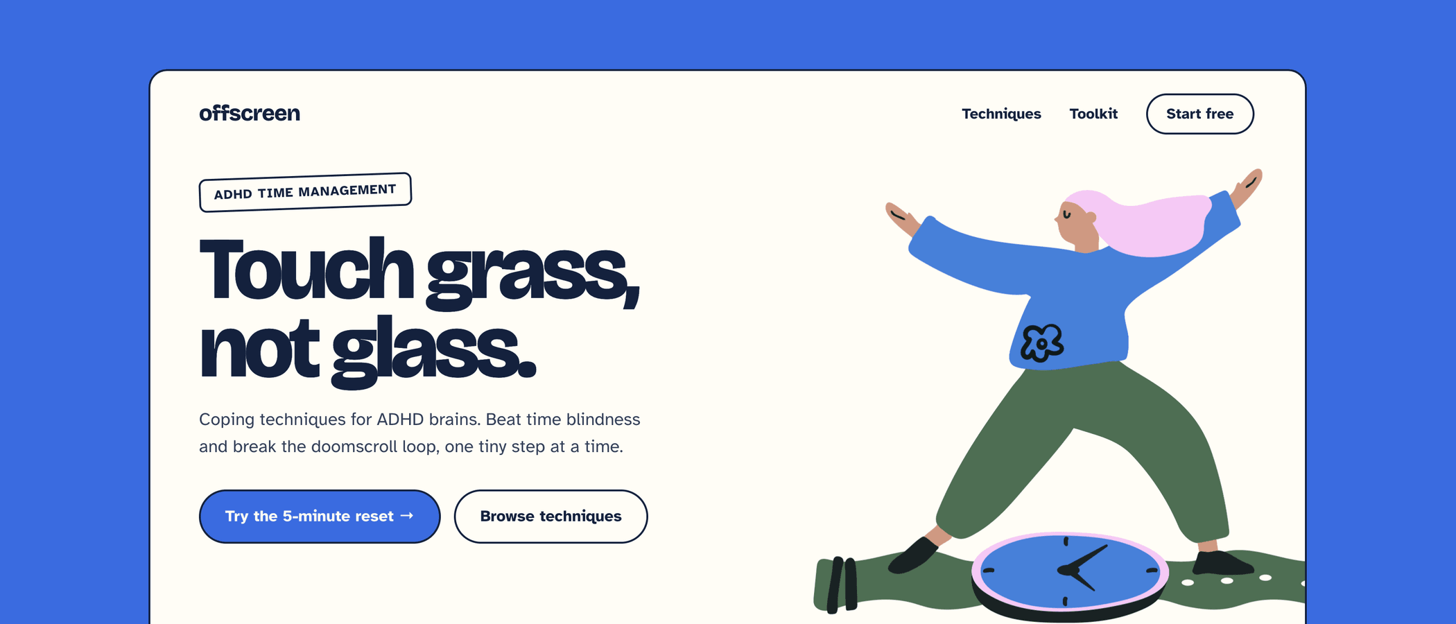
Dark skies, glowing brains and a lone figure in the shadows are the three most common images in mental health design, and the quickest way to make your app or website look generic. This guide shows what to use instead.
Three clichés to retire
These images stigmatise the people your product is for, and they have been used so often that users scroll past them. Here is why each one fails and what works better.
1Dark and gloomy graphics
Grey skies, rain clouds and black-and-blue palettes tell users that mental health is only darkness. Someone opening your app or website on a hard day gets their mood reflected back with no way forward. Nearly every competitor does the same, so your product disappears among them.
Try instead: a warm, calm palette with one clear focal point, and people doing something small and ordinary.
2Brains with lightning
Glowing brains, sparks and gears reduce a person to a malfunctioning organ. For ADHD, the lightning bolt turns everyday experience into a caricature of chaos. It also reads as clinical and cold, and it is the first result in every stock library.
Try instead: show the person's day and emotions, such as a desk, a timer or a half-finished list. Relatable actions and moments say more than anatomy.
3The lone figure in the dark
A person sitting alone with their head in their hands, or with their back turned, suggests that struggling is something to hide. It reinforces isolation and shame, which is the opposite of what a support product should signal.
Try instead: people with agency, such as reaching for a phone, talking to a friend or taking a break. Put support inside the picture.
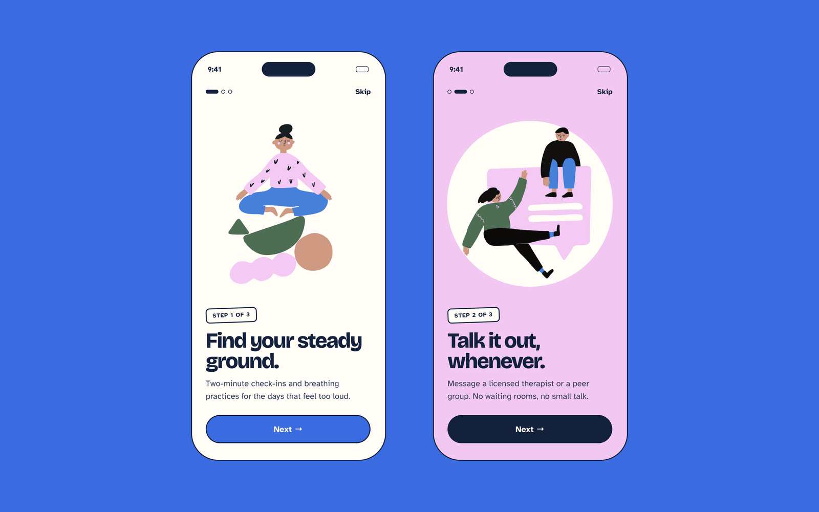
What to show instead
Four rules cover most mental health and ADHD interfaces.
- Everyday moments over symbols. A person at a desk with a timer is more relatable than a storm cloud. Where it fits, use expressive poses, such as slumped shoulders, a stretch or a raised hand, to communicate the emotion more clearly.
- Warm, calm colour. Keep enough contrast for text, and never place copy over busy artwork.
- One idea per image. Cluttered screens compete for attention, which matters most for users who find focus hard.
- One consistent hand-drawn style. Visible line work feels human instead of clinical, and a single style makes the product feel trustworthy.
Where illustrations help most
Five screens, in apps and on websites, give the best return, because each has a job that text alone does poorly.
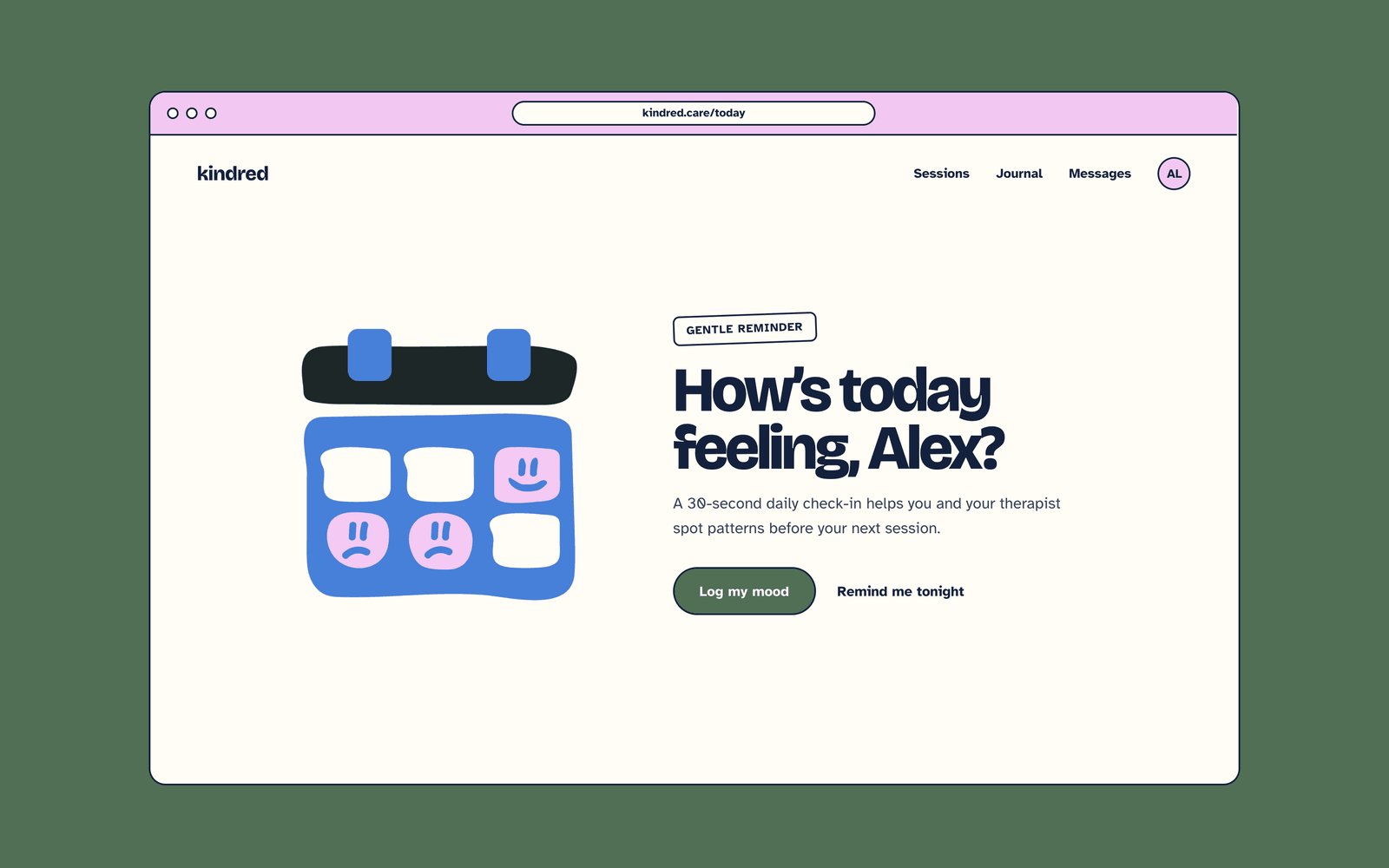
Before and after: an empty task screen
The same screen reads very differently with and without an illustration. Both versions below use identical text and the same button.
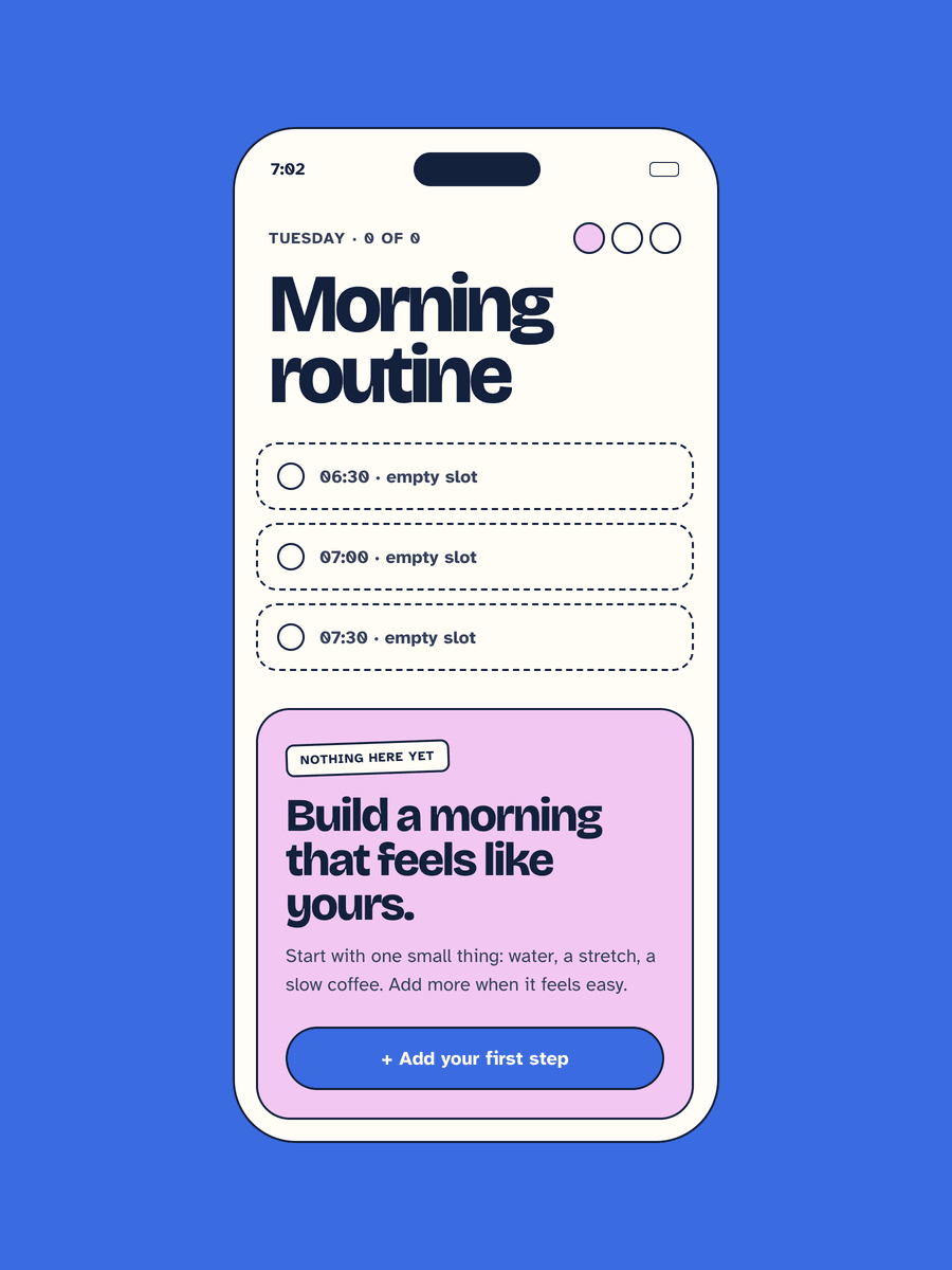
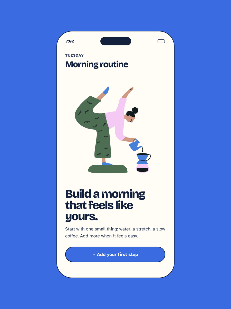
What changes in the second version:
- Clearer hierarchy. The eye lands on the picture, then the headline, then the button.
- Less "broken" feeling. An empty screen with only text can look like something failed to load. A friendly image tells the user it is intentional.
- A warmer tone. The text-only version feels clinical, which is the wrong signal for a product about wellbeing.
These are design observations from one mockup, not test results.
Quick checklist
- No dark skies, rain clouds or all-grey palettes
- No brains, lightning bolts or gears
- No lone figure with head in hands or back turned
- Each image shows one everyday moment
- Text stays readable and never sits on busy artwork
- Every illustration comes from one consistent hand-drawn style
Try Mind Shelter and Mind Shelter 2
Both packs have 27 hand-drawn illustrations made for apps and websites. Mind Shelter packs cover anxiety and recovery, ADHD, autism and depression. Easy-to-edit files, personal or commercial licence.
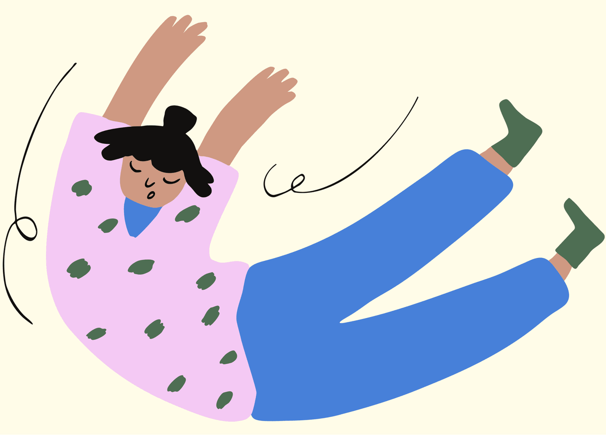
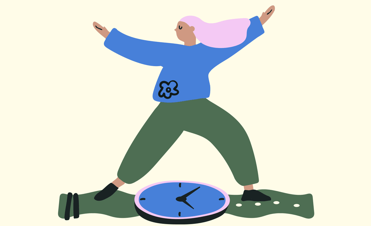
Download six free samples and test them in your own design before you buy.