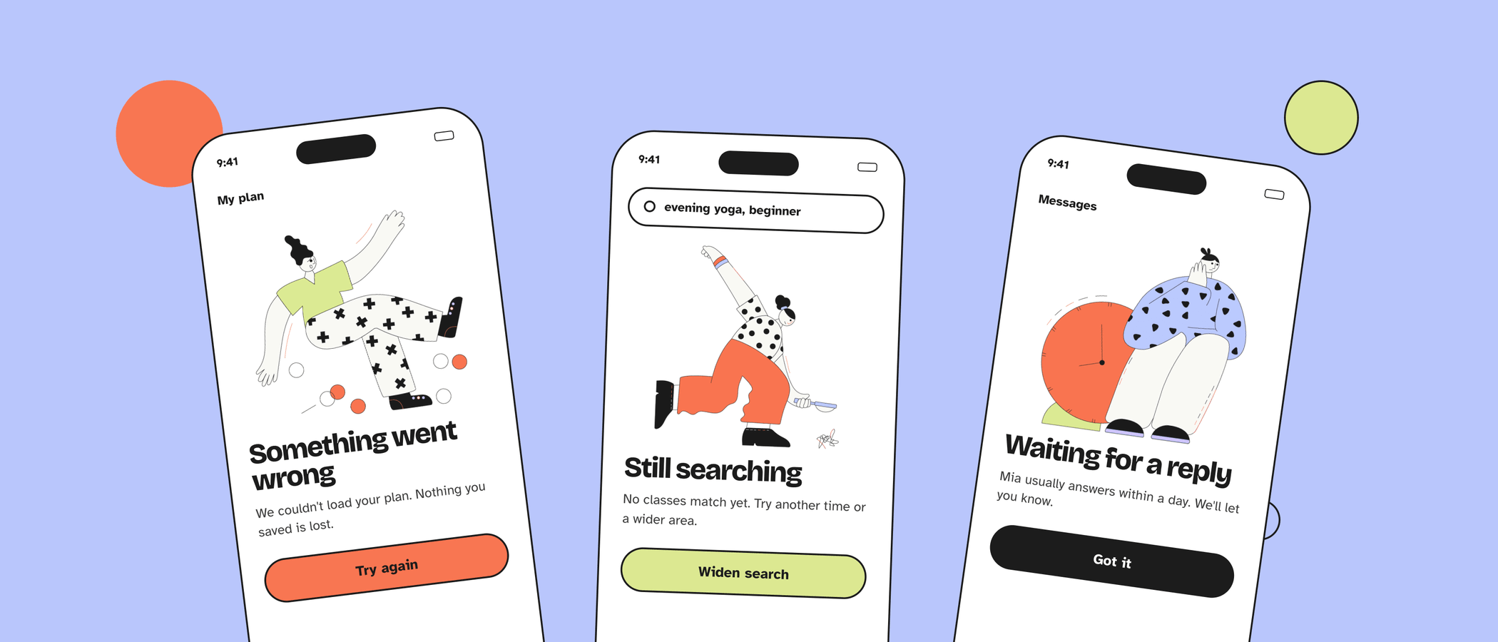
An empty screen is often the first thing a new user sees, and the moment most likely to make an app look unfinished. A good empty state explains what is going on, shows what will appear here and offers one clear next step.
What to avoid
These patterns show up in almost every product, and each makes an empty screen feel colder or more confusing than it needs to.
1A grey icon and “No data”
A faded folder or inbox icon with two words of system copy looks exactly like a loading failure. It tells the user nothing about why the screen is empty or what to do.
Try instead: one sentence explaining the state and a button for the next action.
2Astronauts, tumbleweeds and broken robots
Space scenes, deserts and sad robots are the stock answer for every empty or error screen. They are so familiar that users skip them, and they rarely connect to what your product actually does.
Try instead: a scene from your users' real context, such as a person writing their first note or setting up a first task.
3Jokes when something went wrong
“Oops! Our hamsters fell asleep” is charming once. On the third failed upload, or in a health or finance product, it reads as careless.
Try instead: a calm, human tone. Save humour for first-use screens, where nothing is at stake.
Three main kinds of empty states
Each kind starts from a different user feeling, so each needs different copy, a different action and a different picture.
1First use and onboarding
The user has just arrived and has not created anything yet. This is the empty state with the most potential, because it can teach the product while showing what success looks like.
- One primary action. “Add your first task” beats a row of four equal buttons.
- Offer a shortcut. Templates, sample data or an import option help users who do not want to start from zero.
2No results
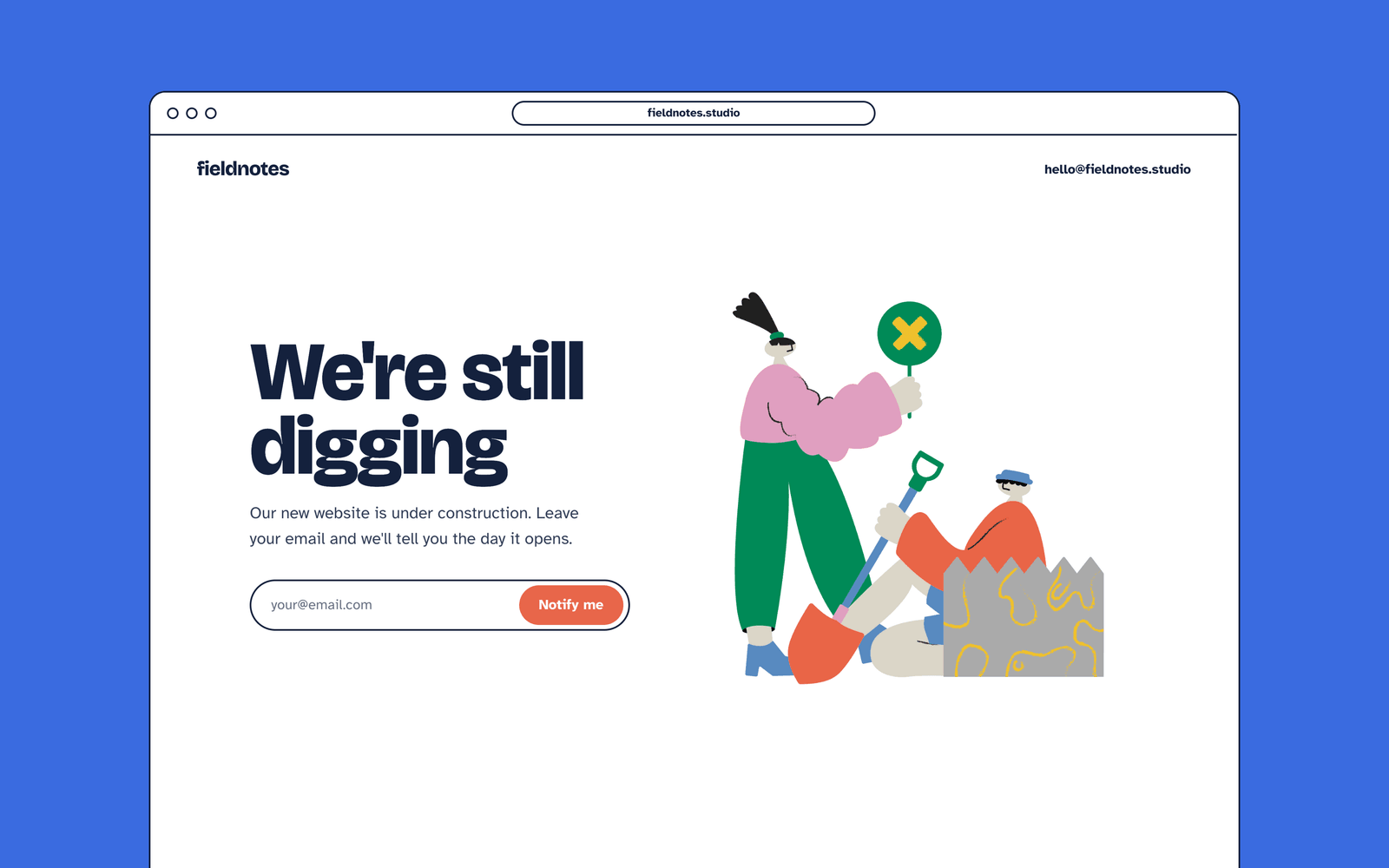
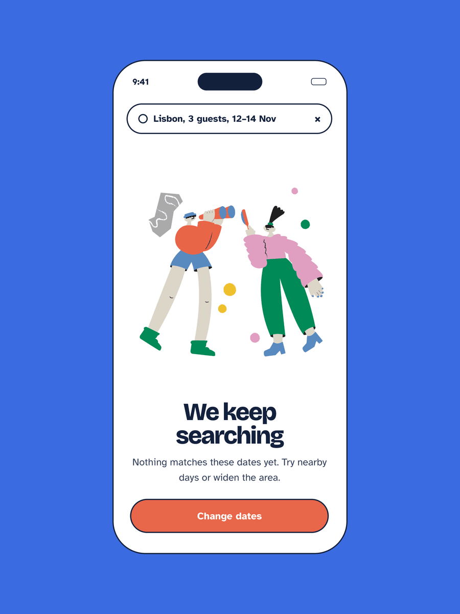
The user searched or filtered and got nothing back. They did the work, so the screen should help them recover quickly rather than just report the outcome.
- Repeat the query. “No results for ‘sleep jornal’” lets the user spot a typo at a glance.
- Suggest a way out. Offer to clear filters, show spelling suggestions or link to popular items.
- Keep the illustration small. Users here want to search again, so the search box and suggestions come first.
3Errors
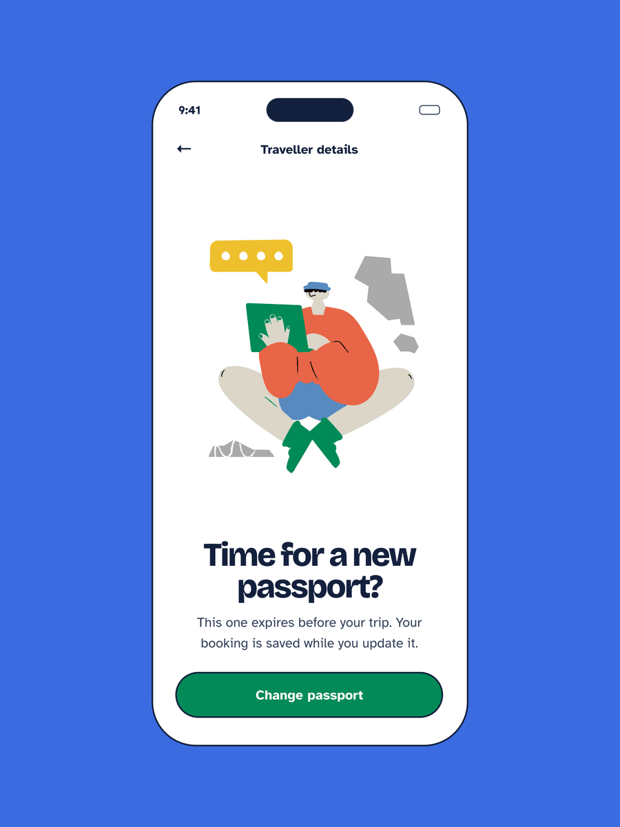
Something failed: a connection dropped, a page is missing or the user lacks permission. The user is often frustrated, so clarity matters more than personality.
- Say what happened in plain words. “We couldn’t load your entries” instead of an error code.
- Say whether their work is safe. This is usually the first thing people worry about.
- Give a fix. A retry button, a link home or a way to contact support.
Quick reference
Keep one visual system across the states
Empty states are sometimes designed one at a time, by different people, months apart. That is how a product ends up with a flat icon on one screen, a 3D character on the next and a stock photo on the error page. Users notice, and the product feels pieced together.
- One illustration style. Same line weight, colour palette and character proportions on every state.
- One layout. Picture, headline, one line of copy, one button, in the same order and spacing.
- Scale by state. Large for first use, medium for no results, small for errors, where the fix matters most.
- Same characters. Make the product feel like one place rather than a collection of screens.
Write the copy first
An illustration supports the message; it cannot replace it. Draft the headline, the one-line explanation and the button label before choosing a picture, then pick the scene that shows the same idea. If the screen still works with the image hidden, it is accessible, and the alt text can stay short or empty for purely decorative art.
Quick checklist
- The screen says why it is empty
- There is one clear primary action
- No-results screens repeat the query and suggest a way out
- Error screens say whether the user's work is safe
- No astronauts, tumbleweeds or jokes on errors
- Every state uses the same illustration style and layout
Try Friendly Onboarding or Vibrant HR
Both packs fit empty and error state UI, each in its own hand-drawn style. Easy-to-edit, with a personal or commercial licence.